The short answer
Good LED content for a finance conference starts with the wall's exact pixel dimensions from the LED vendor, not a standard 16:9 frame. Design for the camera as much as the room: keep a clear zone where speakers' heads will be, avoid large areas of pure white and very fine lines, and use restrained motion so the backdrop never competes with the conversation. A complete show package includes stage looks for each session type, session title slides, speaker cards, lower thirds, walk-in and walk-out loops, transitions, sponsor graphics, and countdowns. Start 8 to 12 weeks out and test everything on the actual wall before show day.
At most finance conferences, the LED wall behind the stage is the single largest piece of branding in the building. It is behind every speaker in every photo, every livestream shot, and every clip that gets shared after the event. Yet stage content is often the last thing designed, handed off as a set of slides stretched to fit.
We treat the LED wall as scenery, not a screen. Here is what works, what falls apart on camera, and how to plan a show package that holds up.
Start With the Wall, Not a Template
LED walls are built from panels, and the total resolution depends on the wall's size and pixel pitch (the distance between pixels). A wall is rarely a standard 1920x1080 frame. It is often much wider than 16:9, sometimes split into several surfaces, like the three LED walls on the main stage at [REDACTED] 2024.
- Get the pixel map from your LED vendor before any design starts: total pixel width and height for every surface.
- Design at native resolution. Content that is stretched or scaled to fit looks soft on a large wall and softer on camera.
- Know where the seams and gaps are on split walls, and keep text and faces away from them.
- Check viewing distance. Finer pixel pitch looks sharper up close and on camera. The front rows and the cameras are the toughest audience.
Design for the Camera, Not Just the Room
What looks great from the audience can fall apart on the stream. The camera sees the wall differently than people do.
- Leave a clear zone behind the speakers. Keep logos and text out of the area where heads will be in a medium shot, or they will be cut off in every frame.
- Avoid large areas of pure white. Bright backgrounds blow out on camera and push the camera exposure down, which darkens speakers' faces. Darker, richer backgrounds make speakers pop.
- Avoid very fine lines and small text. Thin details can shimmer or create moiré patterns on camera.
- Keep motion restrained. Slow, subtle movement adds life. Fast motion behind a panel distracts from the conversation and looks busy on the stream.
- Check the look through the cameras during rehearsal, not just from the house.
What a Complete Show Package Includes
A finance conference needs more than a logo loop. A complete package covers every moment of the show:
- Stage looks for each session type: keynote, panel, fireside chat, and breaks.
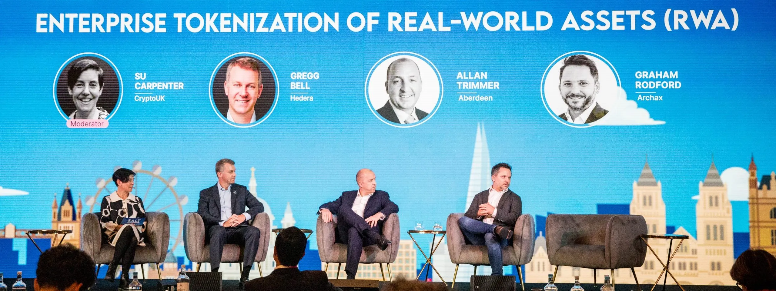
- Session title slides with speaker cards, names, titles, and firms, like the SALT London stage shown above.
- Lower thirds for the livestream and recordings.
- Walk-in and walk-out loops for doors and breaks.
- Transitions and stingers between segments.
- Countdowns for session starts and for confidence monitors.
- Sponsor graphics and sponsor loops.
- Social media assets built from the same design system so the event looks consistent online.
Field note
For SALT's global event series, every event had its own branding, programming, and venue, from Bermuda to Jackson Hole to London. We built custom stage graphics, LED wall content, branded signage, and speaker graphics for each one, like the session look on the SALT London stage shown above, so every event felt distinct while still unmistakably SALT.
Lower Thirds That Work
Remote viewers do not always recognize the people on stage the way the room does. A lower third is how they know who is speaking and why it matters.
- Include name, title, and firm, and show it within the first few seconds a speaker is on camera.
- Use a clean, highly legible typeface at a size that reads on a phone.
- Build lower thirds from a template with editable fields so a late speaker change takes minutes.
- Get name spellings and titles approved in writing before show day. A misspelled name on a live stream is the kind of error people remember.
Sponsor Graphics Without the Clutter
Sponsors expect visibility, but a wall crowded with logos looks cheap and competes with speakers.
- Map sponsor deliverables by tier before design starts: what appears on stage, in loops, on signage, and on the stream.
- Give sponsor moments their own space, such as walk-in loops and break slides, rather than cramming logos onto live session looks.
- Collect logos early in vector format, and confirm light and dark versions.
A Realistic Timeline
- 8 to 12 weeks out: brand guidelines, pixel maps, and sponsor list gathered; style frames designed and approved.
- 4 to 6 weeks out: full package built: stage looks, templates, loops, and transitions.
- 1 to 2 weeks out: speaker names and titles loaded, sponsor graphics finalized, compliance or disclaimer slides approved.
- Show week: content tested on the actual wall and through the cameras, then adjusted.
Graphics always take longer than anyone plans. Build in at least two review rounds, and name one person on the client side who can give final approval.
The bottom line
Stage content is scenery, branding, and broadcast design at the same time. Build it to the wall's real dimensions, design it for the camera, keep it restrained, and test it on the actual screens before anyone walks on stage.
Frequently Asked Questions
What resolution should LED wall content be?
LED wall content should be built at the wall's native pixel resolution, which depends on its size and pixel pitch and is rarely a standard 1920x1080 frame. Get the exact pixel map for every surface from the LED vendor before design starts, and never stretch standard slides to fit.
What colors work best on an LED wall on camera?
Darker, richer backgrounds usually work best on camera because they make speakers stand out. Large areas of pure white can blow out on camera and force the exposure down, darkening speakers' faces. Very fine lines and small text can shimmer or create moiré patterns.
What should a conference graphics package include?
Stage looks for each session type, session title slides with speaker cards, lower thirds, walk-in and walk-out loops, transitions, countdowns, sponsor graphics, and social media assets built from the same design system.
How far in advance should event graphics be started?
Start 8 to 12 weeks before the event with brand guidelines, the LED pixel map, and style frames. Build the full package 4 to 6 weeks out, load speaker names and finalize sponsor graphics in the last one to two weeks, and test everything on the actual wall during show week.
What information goes on a conference lower third?
The speaker's name, title, and firm, shown within the first few seconds they are on camera, in a legible typeface sized to read on a phone. Name spellings and titles should be approved in writing before show day.
How do you include sponsor logos without cluttering the stage?
Map sponsor deliverables by tier before design starts, and give sponsors dedicated moments such as walk-in loops, break slides, and signage rather than crowding logos onto live session backgrounds that sit behind speakers.